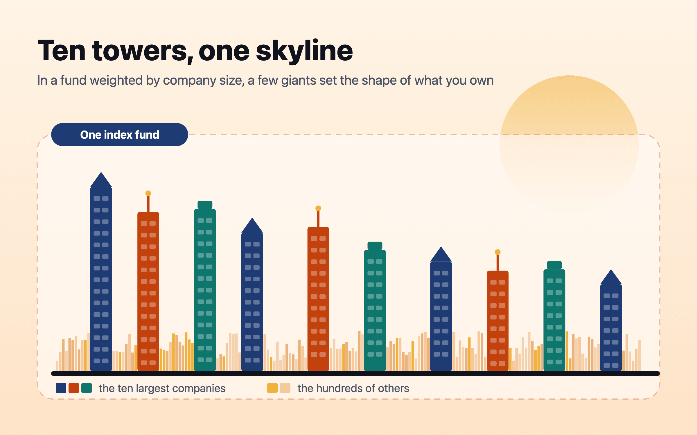
Ten companies are now about two-fifths of the S&P 500. Here is what that means for an index fund, and how to check your own.
At the end of September 2026 the ten largest companies made up 39.1% of the S&P 500, a level last seen in the mid-1960s, and a “world” index was 73% American. Concentration is not a forecast of a crash, but it does mean an index fund carries more single-company, single-sector and single-country risk than its name suggests. You can measure your own in four checks and decide whether to spread it.
Nivritee Research · 7 August 2026 · updated 15 October 2026 · 7 min read
An S&P 500 index fund holds about 500 companies, and most people buy one precisely because it spreads their money widely. On 30 September 2026, though, ten of its 503 holdings made up 39.1% of the index, and the largest single company, Nvidia, was 8.4% on its own1. S&P Dow Jones Indices, which runs the index, says the top ten reached almost 40% by mid-2025, a level not seen since the mid-1960s2.
This is called market concentration: a large share of an index’s value sitting in a few companies. It matters to anybody with an index fund, a workplace pension or a SIP into a US or global fund, because what those funds do over the next decade depends more than usual on what happens to a handful of businesses. This article sets out how concentrated the main indices are, what history says about periods like this one, what the evidence on equal weighting shows, and how to check how concentrated your own money is.
Share of listed US companies that explain the market’s whole net gain since 1926
How concentrated the market has become
In S&P’s own long series, the top ten’s share of the index fell for most of three decades: from 38.2% in June 1965 to a low of about 17% in the mid-1990s2. It rose in the dot-com boom to about 26.6% at its March 2000 peak, fell back below 20% by 2010, and then climbed almost without pause after 2015. Over the ten years to June 2025 the top ten’s weight rose by 20.34 percentage points, the largest rise in any decade of the series2.
The share of the S&P 500 held by its ten largest companies, 1965 to 2026
June readings from 1965 to 2025, measured from the bar heights of the quarterly chart in S&P Dow Jones Indices’ April 2026 study (they reproduce its printed 1965 total and its 20.34-point rise from 2015 to 2025); September 2026 from the index factsheet. Each point is the weight of whichever ten companies were largest at the time. Concentration today is back where it was in the mid-1960s. 2,1The figures in this chart
Ten largest companies, % of the index
1965
38.2%
1970
33.9%
1975
29.1%
1980
25.8%
1985
19.5%
1990
18.8%
1995
17.7%
2000
26.5%
2005
20.9%
2010
19.1%
2015
17.8%
2020
28.1%
2025
38.1%
Sep 2026
39.1%
The cause is not mysterious. The companies at the top are mostly in technology and related fields, and their share prices have risen faster than the rest of the market. The International Monetary Fund noted in October 2025 that the information technology sector alone was 35% of the S&P 500, that the seven US technology-linked companies often called the Magnificent 7 accounted for 33% of the index, and that a standard measure of concentration in the S&P 500 was substantially higher than during the dot-com bubble5.
Why a few companies do most of the work
Concentration is partly how stock markets have always worked. Hendrik Bessembinder studied every US-listed company from 1926 and found that the best-performing 4% explain the net gain of the entire US stock market over that time; most individual shares did worse than Treasury bills4. A small number of very large winners carry the averages.
An index weighted by company size, which is what most index funds are, lets those winners grow inside it automatically. S&P’s study found that the ten companies at the top in mid-2025 had joined the index at an average weight of 0.58% and gone on to reach an average peak of 4.37%2. Nobody running the fund had to spot them. That is the strength of a cap-weighted fund, and also why it ends up holding the most of whatever has already risen the most.
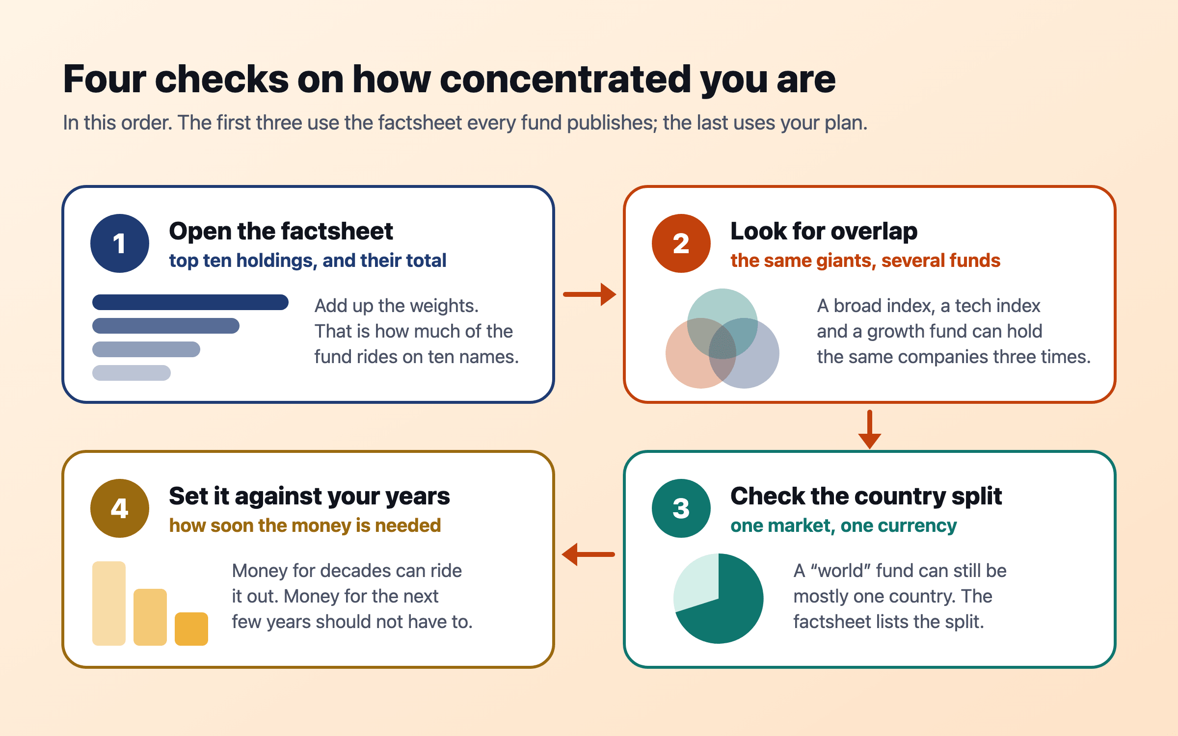
Four checks, in order. The first three use the factsheet every fund publishes; the fourth uses your own plan.
We have been here before: 1965, the Nifty Fifty and 2000
1965. The top ten were AT&T, General Motors, Standard Oil of New Jersey, IBM and six other giants of the day, together 38.24% of the index; AT&T alone was 9.11%2. Three of those ten later entered bankruptcy proceedings. Over the following decade the top ten’s weight fell by 9.16 points and the index’s price return was only 1.17% a year2.
The Nifty Fifty, 1972. Investors paid almost any price for fifty “one-decision” growth companies. Howard Marks recalls Coca-Cola reaching 46 times earnings in mid-1972, 2.4 times the market’s multiple, then falling 65% over the next year and a half6. He also notes that the durable half of the group went on to earn respectable returns over 25 years, even measured from their pre-crash highs6.
2000. The top ten peaked at about 26.6% in March 2000, lower than today2. For the decade from June 2005 the S&P 500’s price return was 5.46% a year, against 10.00% a year in the decade before2.
2015 to 2025. Concentration rose by 20.34 points and the price return was 11.66% a year2. Rising concentration was, in this decade, a sign of the giants winning rather than a warning that was ignored.
The honest reading of the history is that concentration does not predict a crash. Across six decades, S&P found only a mildly positive link between changes in concentration and the index’s performance2. What history does show is that the companies at the top change, sometimes painfully, and that a very high price for a few favourites has ended badly before. An index fund owner does not need to forecast which; it is enough to know how much of the money depends on the answer.
A “world” fund is mostly one country
Many people outside the US buy a global fund to avoid betting on one market. The most common global benchmark, MSCI World, had 72.94% of its value in US companies at the end of September 2026, with Japan next at 5.91% and the UK at 3.41%3. Its own top ten were 27.85% of 1,249 holdings, all of them American3. Adding emerging markets helps a little: the MSCI ACWI index was 64.21% American, with a top ten of 25.40%7.
The surprise for many readers is that their home index is often more concentrated still. Singapore’s Straits Times Index had 82.2% in its top ten and DBS alone was 29.77%8. India’s Nifty 50 had 52.3% in its ten largest, with HDFC Bank at 10.38%9. The UK’s FTSE 100 had 49.49% in its top ten10. Emerging markets as a whole had 39.03% in their top ten, with TSMC at 15.63%11. Developed markets outside North America, measured by MSCI EAFE, were the least concentrated of the indices here, with 14.20% in the top ten12.
Share of each index in its ten largest companies, 30 September 2026
From each index provider’s September 2026 factsheet. The Nifty 50 figure is the sum of the ten weights its factsheet lists. A single-country index with fewer members is usually more concentrated than the S&P 500; the global indices are less concentrated by company but mostly American. 8,9,10,1,11,3,7,12The figures in this chart
Ten largest companies, % of the index
Straits Times Index (Singapore)
82.2%
Nifty 50 (India)
52.3%
FTSE 100 (UK)
49.5%
S&P 500 (US)
39.1%
MSCI Emerging Markets
39.0%
MSCI World
27.9%
MSCI ACWI (all countries)
25.4%
MSCI EAFE (developed, outside North America)
14.2%
Equal weight or cap weight: what the evidence says
The obvious alternative is an equal-weight index, which holds the same 500 companies but puts the same amount in each and resets the balance every quarter. Over its first twenty years of live data, from 2003 to 2022, the S&P 500 Equal Weight Index returned 11.50% a year against 9.99% for the ordinary S&P 50013. S&P attributes more than half of that historical edge to a tilt towards smaller companies, and notes that equal weight did better in the years after the early-2000s technology bubble and beat the main index by about 7% in 202214.
The last decade went the other way. In the ten years to September 2026, equal weight’s price return was 9.52% a year against 13.44% for the cap-weighted index15,1. In calendar 2023, 2024 and 2025 the S&P 500 rose 24.23%, 23.31% and 16.39% in price, while equal weight rose 11.56%, 10.9% and 9.34%15. Equal weight is not a cure for concentration so much as a different bet: more on smaller companies, more trading to rebalance, and long stretches behind the main index when the giants keep winning.
Each approach has had long periods ahead. Past returns say nothing certain about the next decade. 13,1,15
Period
S&P 500 Equal Weight
S&P 500
Ahead
2003–2022, a year (total return)
11.50%
9.99%
Equal weight
10 years to September 2026, a year (price return)
9.52%
13.44%
Cap weight
2022 (price return)
−13.11%
−19.44%
Equal weight
2024 (price return)
10.9%
23.31%
Cap weight
How to check your own concentration
Open each fund’s factsheet. Every fund publishes its top ten holdings and their weights. Add them up and multiply by what you hold in that fund: that is how much of your money depends on ten companies.
Look for overlap. A broad US fund, a technology fund and a “growth” fund often hold the same giants. Add each company’s share across your funds; three funds can mean one bet held three times.
Check the country split. The factsheet lists it. A fund called “world” or “global” can still be three-quarters one country, which also means three-quarters one currency.
Set it against your years. Money you will need in the next few years should not depend on a handful of share prices. Money for decades can carry more, if you have decided to and know how much.
One detail matters when you read those results. In Nivritee a fund or ETF never counts as a single company, because an index fund is hundreds of companies under one name, so an S&P 500 fund never looks like a single-company bet (the six investment readings). The concentration reading does not look inside a fund to its top ten; that is the factsheet’s job, which is why the first step above starts there.
Ways to spread it, if you decide to
Hold the whole world rather than one country. A global fund still leans heavily American, but less than a US-only fund, and it adds companies the S&P 500 does not hold. The case and the history are in global diversification over 125 years and home bias and currency risk.
Stop stacking overlapping funds. Two or three broad funds that do different jobs usually spread risk better than six that hold the same leaders.
Treat equal weight as a deliberate tilt, not a safety measure: it reduces the giants’ share and raises the share in smaller companies, with the long periods behind described above.
Keep near-term money out of shares altogether. Concentration matters most for money you might have to sell in a bad year. Cash, deposits and bonds for the next few years’ spending make the question less urgent; see the bucket strategy.
Rebalance on a rule, not a headline. If shares have grown past the share you chose, trimming back to it once a year takes some of the concentration off without needing a view on any company.
Keep costs low whatever you choose. A diversified fund with high fees can cost more than the concentration it avoids; see what fees cost over 30 years.
Nothing here says the giants will fall. They may keep growing into their weights, as they did for the past decade. The point is narrower and more useful: an index fund is a bet on the market as it is weighted today, and today that weighting is unusually narrow. Knowing how much of your plan depends on ten companies, and deciding whether that is the amount you want, is the whole of the job.
How Nivritee helps
This explains how index concentration works and what the published data shows. It does not recommend any fund, share or index. This is information, not financial advice.
Questions people ask
What percentage of the S&P 500 is in the top 10 stocks?
39.1% at the end of September 2026, with the largest company, Nvidia, at 8.4%1. S&P says that is the highest level since the mid-1960s2.
Is the S&P 500 too concentrated?
It is more concentrated than at any time since the 1960s, and the IMF has flagged it as a risk5. History shows high concentration does not reliably predict a fall, but it does mean an S&P 500 fund depends heavily on a few companies.
How much of MSCI World is the US?
72.94% at the end of September 2026, with Japan next at 5.91%3. Including emerging markets, MSCI ACWI was 64.21% American7.
Is equal weight better than market-cap weight?
Neither wins every decade. Equal weight returned 11.50% a year against 9.99% from 2003 to 202213, then 9.52% against 13.44% a year in price in the ten years to September 202615,1.
How do I check how concentrated my portfolio is?
Add up each fund’s top ten weights from its factsheet, multiply by what you hold, add overlapping names across funds, and check the country split. Then compare the total with how soon you will need the money.
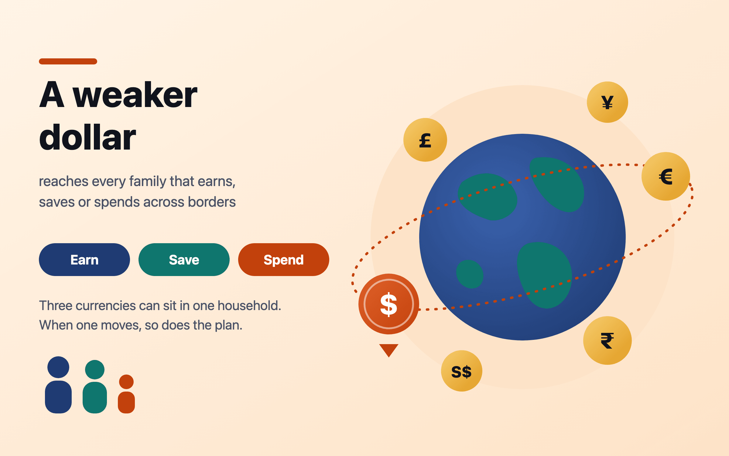
The US dollar index fell 10.8% in the first half of 2025, its worst start to a year since 1973, and the Fed’s broad dollar index ended 2025 down 7.4%. In 2026 the dollar steadied, and the rupee fell to record lows near 97 as oil surged. The same S&P 500 returned 16.4% in dollars in 2025, 2.7% in euros and 22.2% in rupees. What matters for a family is not which way the dollar moves but whether its savings are in the currency it will spend.
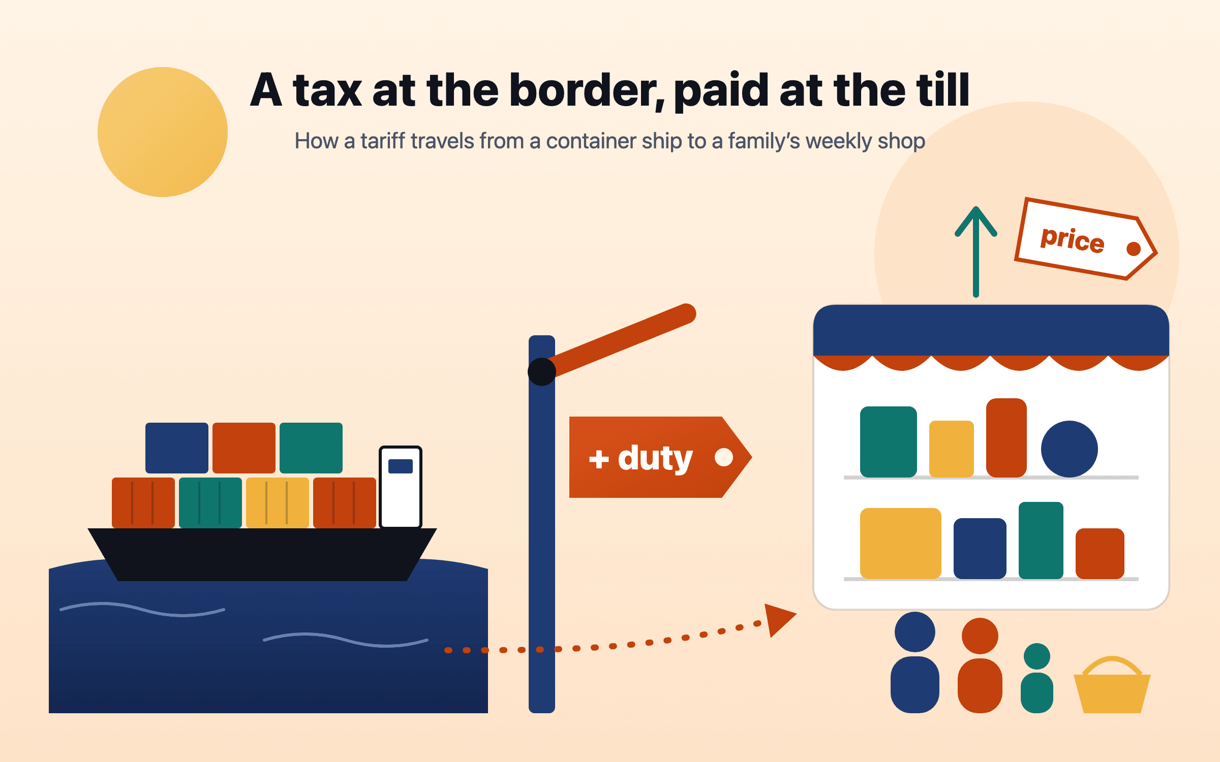
US tariffs rose in 2025 to their highest average level in about ninety years, were cut back by a Supreme Court ruling in February 2026, and were rebuilt under other laws. Research finds the cost lands mostly on buyers in the importing country, spread across importers, shops and households; Yale’s Budget Lab puts it at about $1,100 a year for the average US household. Elsewhere the effect arrives through export orders, jobs, markets and interest rates. The useful response is a budget that knows which costs are rising, a cash buffer sized to your job’s exposure, and no trading on headlines.
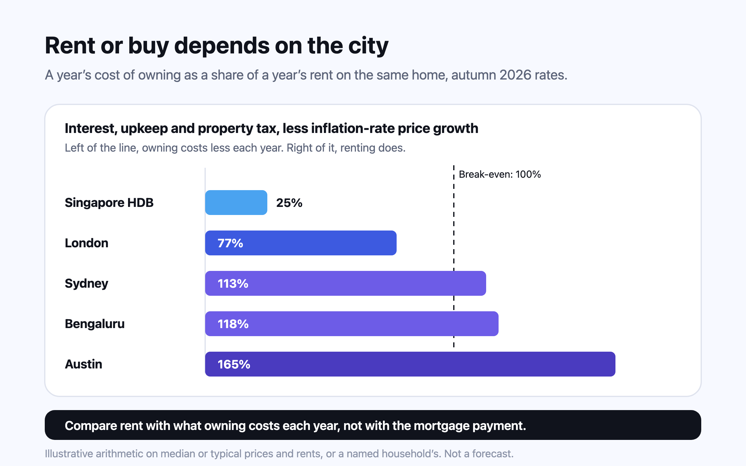
Compare rent with the unrecoverable cost of owning — interest, upkeep, property tax and the return your deposit gives up, less expected price growth — not with the mortgage payment. At autumn 2026 rates, owning the average London home costs somewhat less than renting it, an Austin home costs far more to own than to rent, and an HDB flat in Singapore costs far less. Transfer taxes then decide how long you must stay.
This is general information, not financial, tax or legal advice for your circumstances. Rules and figures change; check the official source for your country, and consult a licensed professional before making financial decisions. Projections are estimates, not predictions.